Explore seven businesses that have excelled with Square Online. Each narrative is distinct, yet they all have one thing in common: using technology to expand and prosper. Whether it's a yoga studio transitioning classes to online or a crafts shop highlighting distinctive products, these businesses demonstrate the flexibility and effectiveness of Square Online.
Square Online is a game-changer for busy small business owners! It's incredibly user-friendly, even if you're not a tech expert. Setting up online ordering or selling products and services? It's a seamless and straightforward process. Plus, it seamlessly syncs with the Square payment system, making transactions a breeze.
Whether you're a shop owner venturing into the digital sphere or a café eager for online orders, Square Online has got you covered. And the best part? Everything is integrated, allowing you to manage all aspects in one convenient place.
Square Online is your go-to solution for entering e-commerce without the hassle. Quick setup, smooth sales, satisfied customers – what's not to love? Get online, start selling, and witness your business flourish.
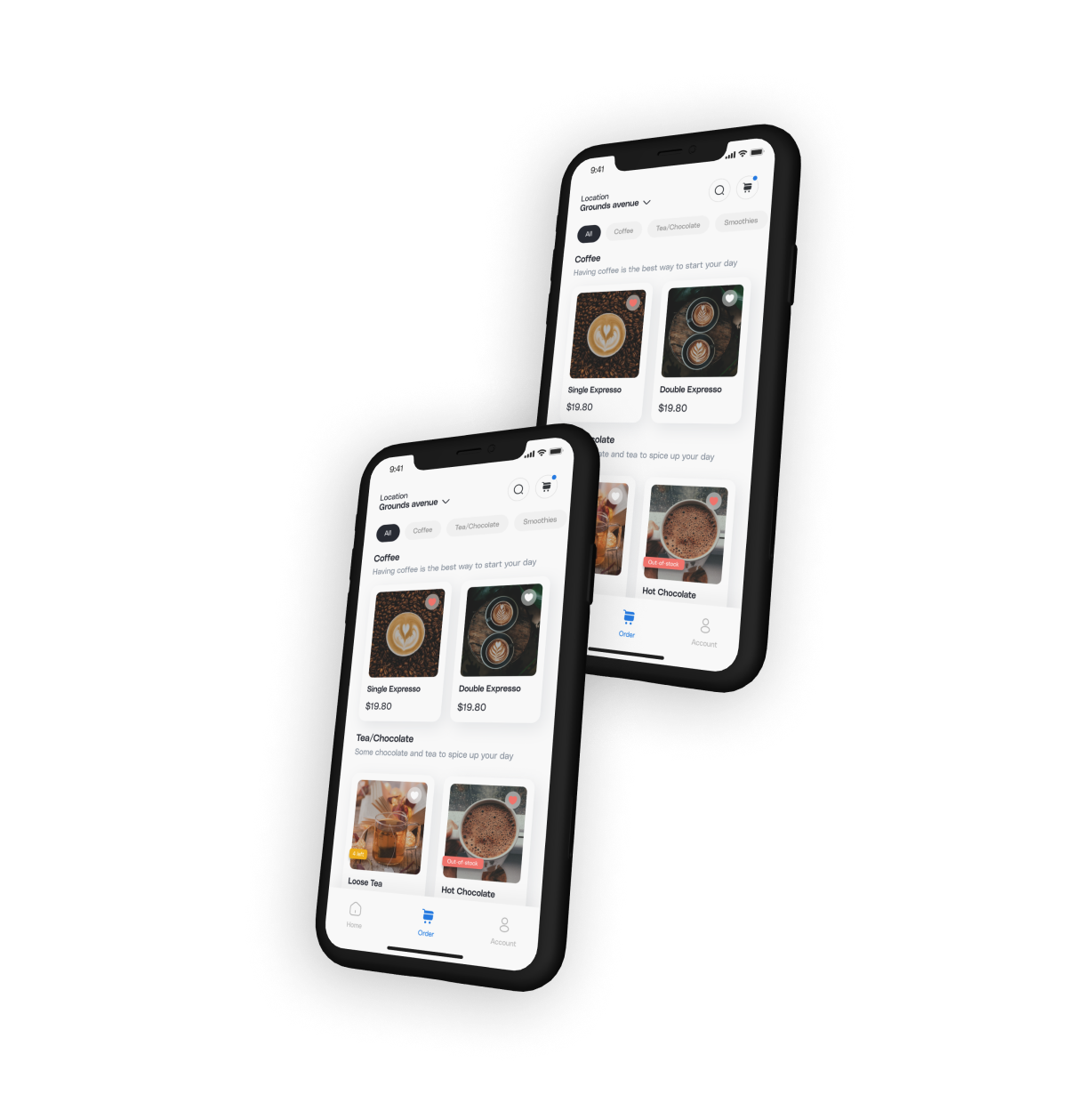
Read more at Per Diem.
Inspired by our community of businesses, we collected seven best practices and e-commerce examples for Square Online stores. Explore these seven remarkable Square Online stores to get ideas for your 2024 e-commerce endeavors. To improve your online business appearance, explore creative designs, effective tactics, and the newest trends.
Use White Space like Plomo Quesadillas
Don't overlook the influence of white space on your landing page. It's more than just vacant space; it serves as a potent design element. With Per Diem Online, you can skillfully employ white space to craft a neat, uncluttered appearance, aiding in directing focus toward crucial elements of your page and making the content easier to grasp.
Plomo Quesadillas WebsiteStreamline Navigations like Coffee Dose
A tidy and straightforward navigation system is crucial for an excellent landing page. With Square Online, you can establish a user-friendly menu that seamlessly directs visitors across your site. Keep it uncomplicated; prioritize simplicity in locating information rather than opting for complexity. This method guarantees that potential customers can easily explore your offerings, resulting in an enhanced user experience and potentially increased sales.
Coffee Dose WebsiteBranding and Color Schemes like The Bagelers
Your landing page serves as the online representation of your business, and Square Online makes it simple to imbue it with your distinctive identity. Choose a color scheme that aligns with the ethos of your brand. Maintaining consistency in colors and design elements throughout the page aids in building brand recognition, ensuring that your business remains memorable and relatable to your audience.
The Bagelers WebsiteImagery like Chip City
Top-notch visuals can convey a lot on your landing page. With Square Online, you can incorporate visually captivating images that showcase your products or services. These images should not only be attention-grabbing but also capture the essence of your brand. This would aid in establishing a connection with your visitors.
Chip City WebsiteResponsive Design Like Trophy Coffee
Alongside a mobile app that Per Diem offers, in the current mobile-centric era, having a responsive design is essential. Square Online ensures that your landing page appears excellent and operates seamlessly on all devices. This flexibility improves user experience, ensuring that your site remains accessible and attractive, whether it's accessed on a desktop, tablet, or smartphone.
Trophy Coffee WebsiteCall To Action like Joanie's
If your business utilizes an app, leverage your landing page to promote downloads. With Square Online, you can integrate a noticeable and compelling call-to-action for app downloads. This call-to-action should be strategically positioned and crafted to capture attention, guiding visitors to download your app and consequently enhancing their interaction with your brand.
Joanie’s WebsiteFooter Information like Extract Juicery
The bottom section of a landing page, commonly known as the footer, is mostly underestimated, yet it plays a crucial role. This is where visitors typically seek contact details, social media links, FAQs, and other important information. Square Online enables you to personalize your footer, incorporating all vital details. This turns it into a valuable resource for visitors and a trust-building tool for your business.
Extract Juicery WebsiteBonus - What to Avoid when building with Square Online?
Cluttered Layouts: Steer clear of overwhelming your website with an excess of content, images, or widgets. For instance, having multiple pop-up ads that disrupt the user experience.
Too Many Fonts and Colors: Stick to a limited number of fonts and colors for a polished and professional appearance. For instance, a website with a mix of fonts and a multitude of colors.
Lack of Clear Call to Action (CTA): Ensure you provide clear and compelling CTAs to guide users. For example, a website lacking clear CTAs might leave visitors uncertain about what to do next.
Inconsistent Navigation: Maintain uniform navigation menus and layout across different pages. An example would be having the navigation menu in different locations on various pages.
Neglecting Accessibility: Make sure your website is accessible to individuals with disabilities. Failing to provide alt text for images or using design elements that are inaccessible are examples of neglecting accessibility.
Unoptimized Images and Videos: Optimize media files for faster loading times. Using large, unoptimized images that slow down your site's performance is an example of unoptimized media.